April 19, 2019 | Post by Nimit Dholakia
It was a regular Monday until the client comes up with a new project to be designed on Android TV. We had the vast experience to design various UI layouts for Web, Mobile, Tablet and also POS Systems but this was the first time we had to design something for a Smart Television. We were curious to design something new and took the bid.
“There is Always a First Time”
There was an excitement among us to create something like this for the first time. We had our tools ready, simultaneously we also started collecting the inspirations and the data needed to design our first Android TV Application.
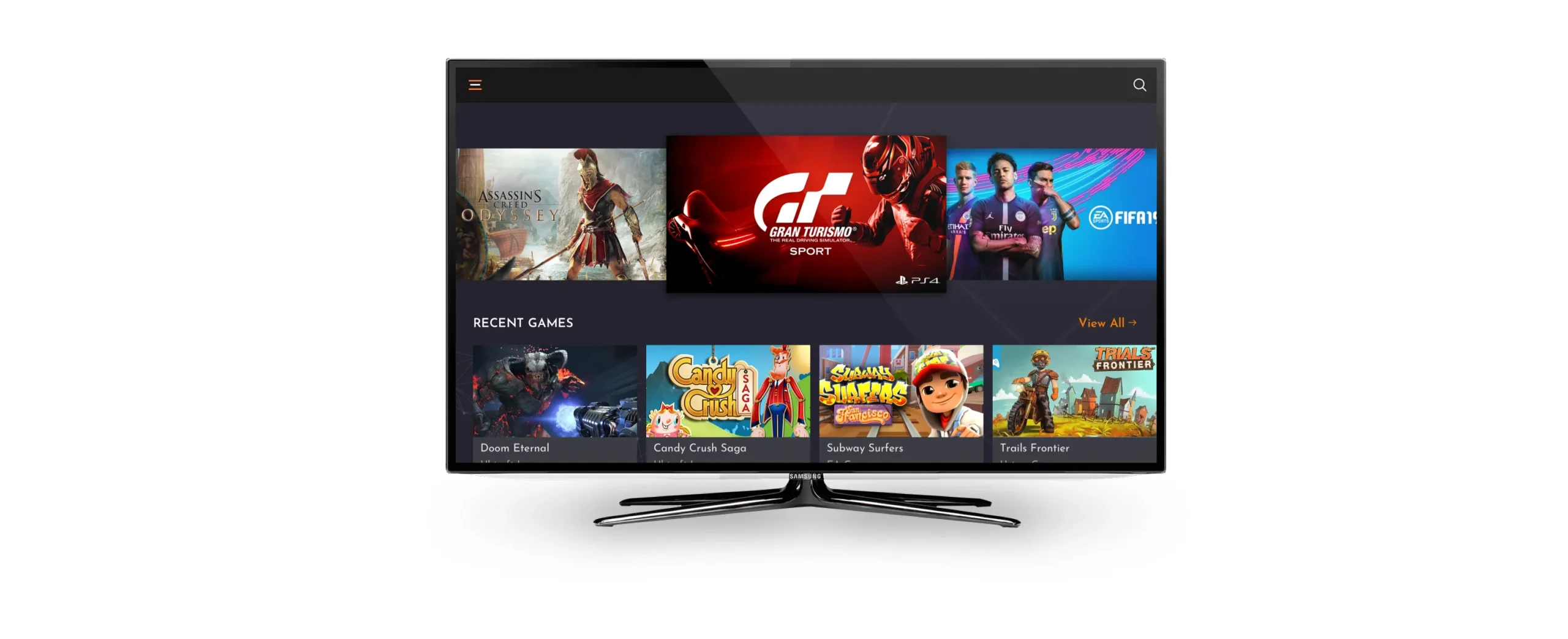
The client told us the requirement; the app was about Cloud Gaming Platform. Something that sounded really cool and made us really excited to work. We conducted the research about the users and the features in the Application and how could we represent it in Android TV. The most important thing to consider was that the Android TV layout is way different than the regular web and mobile layouts.
Google Material Guidelines helped us to get started with the design.

The first thing to do was to understand the device in which the user will use the application. We understood that user had different input devices to use. But in this case, the user will mostly either use an Android Remote or a GamePad to navigate. The navigation was the thing we took seriously because we wanted the user to navigate through minimal steps and shouldn’t feel complexity to use the interface.
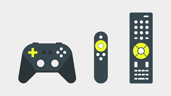
We followed the standard material layout as it looks familiar to the user and much easy to Navigate. We created a section with horizontal scroll (X-axis) and the user can change section by the vertical scroll (Y-axis). The Drawer was kept in case the user chooses to change settings, explore categories and other secondary functions.
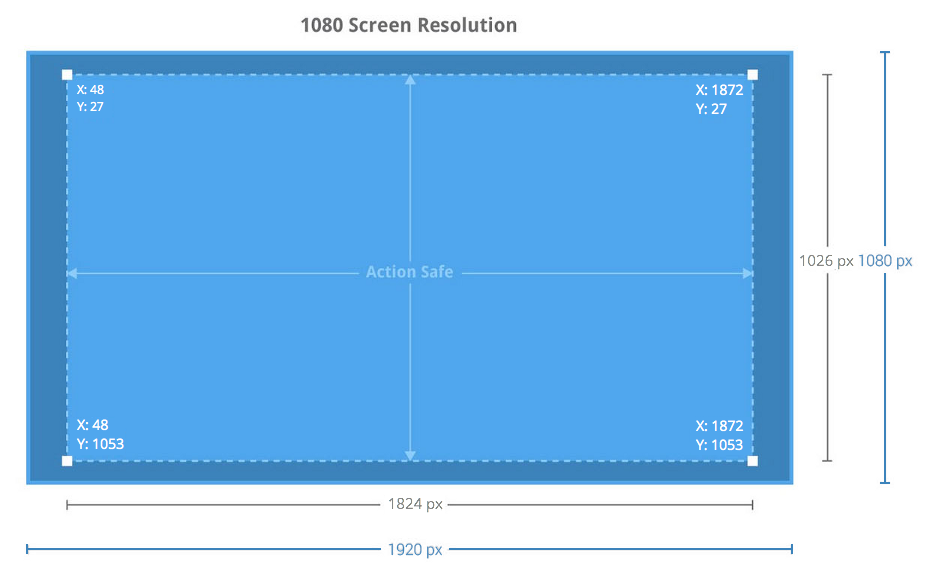
We researched the current gaming platforms like Vortex and also took reference from the gaming consoles like Xbox and Play Station. Those layouts helped us to understand the gaming interfaces and how the data is been presented in the Television. We also had a brief look over popular interfaces on Android TV like Netflix and Youtube for different layout patterns and usability reference.

All the reference applications we saw had banners as the primary focus and were designed like user can easily navigate through the 4 directional navigation pad. We concluded to keep fonts as less as possible to give the user a familiar and intuitive cinematic experience. Also, the font size had to keep visible and large because the user sits 5–10 ft away from the television.
We had always loved white spaces and minimal look on the application but in this case, white was not the color that the users want to see in the big screen. So we decided to go with the Dark and Matt colors which would be less noticeable by the user. Also, the dark background highlighted game banners and gave it an intuitive look.
As the application was for the gaming we intended to keep a polygon vector in the background in order to give the user a parallax experience. The colors were dark which helped the user to focus on the contents of the application.
We conducted user research and classified 2 categories for the users.
John loves exploring new games whereas Smith wants to continue the same game for a long time. So with these results, we came up with features like Recommendations for John and Recently Played games for Smith. Also, the layout was kept simple so both can navigate easily and play games without any efforts.
The Card layout was perfect to provide a cinematic experience to users. The selected card will highlight and elevate as per material design. We kept Infinite Scrolling for the on the top which contains only banners of the games without any textual information. Also below that, we kept Recently Played Games with the material layout and horizontal scroll.
It was important to give the user the same cinematic experience which the apps like Netflix, Youtube, and other applications provided. Also, we intended the user to have seamless navigation through the screens and the sections.
Finally, the winter came and it was the time for the action. We analyzed all the aspects and tried to represent it visually. The mind mapping and wireframing were completed and User Interface had its turn. We had all the things we needed and it had to be executed.

We had the result for the design it had gaming taste along with the colorful banners. We submitted the interface in which had the positive feedbacks. We also tested it on Android TV and it had the results we expected.
The Journey was adventurous and had many lessons to learn. Android TV was something in which we would love to design again. This design taught us the diversity in the devices and the different experiences to use it.
Thank You for Reading!
#905, The Millennium, Nr. Nana Mava Circle,
150 Ft. Ring Road, Rajkot – 360005, Gujarat, India
 +91-8320120988 , +91-9879839801